This week we talked with Edward Milward-Oliver about Raymond Hawkey, the award-winning graphic designer and author who had a close association with Ian Fleming as well as Len Deighton.
Artistic Licence Renewed: We have a special interest in the work of Richard Chopping, in particular his nine jackets for Ian Fleming’s novels. Raymond Hawkey’s work, with its use of photography and typography, is the antithesis of Chopping’s meticulous illustrations, and yet both have a place in Fleming’s story. How did you come to know Ray Hawkey?

Raymond Hawkey (Image: The Hawkey Estate)
Edward Milward-Oliver: I was familiar with his work many years before I met him. The first Len Deighton book I bought was the Hawkey-jacketed Penguin edition of Funeral in Berlin, with the black and white halftone of Michael Caine across the top half of the cover, and diagonal orange and white hazard lines filling the lower half. I got to know Len Deighton in the late 1970s and he later introduced me to Ray. They’d been friends since they were students at the Royal College of Art in the early 1950s, and he went on to design over forty jackets for Deighton as well as a host of other material associated with the books. Ray and his wife Mary lived in a modernist apartment block in Notting Hill Gate, complete with Eero Saarinen tulip dining table and chairs. A very self-effacing man, whose work continues to speak for him five years after his death.
ALR: Ray Hawkey helped change the look of newspapers and magazines in Britain, and had a major influence on the evolution of British book jacket design. What was his background?
EMO: His father was a commercial traveller. Ray was born in Plymouth in 1930 and grew up in the Cornish village of Delabole, home to the oldest working slate quarry in England. The family had very little money for anything other than essentials, but Ray clearly possessed an early talent for illustration for he won a scholarship to Plymouth School of Art.
ALR: His contribution to Fleet Street and to book publishing was so radical. What was the springboard for that?
EMO: By the age of sixteen he’d already developed a strong interest in American culture. And this was reinforced when he won a scholarship to the Royal College of Art in London, where he mixed with like-minded students who shared his enthusiasm for bold statements that broke away from ‘good design’.
ALR: Chopping taught at the College in the early 1960s, but this would have been a decade earlier?
EMO: Yes. At a time when many of the tutors and students were still in the thrall of a pre-war English craft tradition. But Ray was increasingly influenced by designers and photographers like Saul Bass, Herb Lubalin, Alexander Liberman, Irving Penn and Richard Avedon.
ALR: Photography was then part of the RCA’s curriculum?
EMO: The photography department wasn’t established until 1967, under John Hedgecoe. Many in the College looked down on photography as a second-rate pursuit. But for Hawkey and Deighton it was an exciting new discipline. In 1953 Ray caused something of a scandal by including an unretouched full frontal photograph of a nude life model in the College magazine ARK. Both Hawkey and Deighton served as art editors of the magazine.
ALR: The 1950s was a time of rising living standards in Britain. The economy was modernising. Rethinking what made good design for both products and services was essential. That would have held a lot of promise for someone like Ray Hawkey with his keen sense of form and function.
EMO: Yes I think so. After graduating he spent four years with Condé Nast, then moved briefly into advertising with Colman Prentis & Varley. Funnily enough – given his later close association with Deighton’s spy fiction, he was talent-spotted by MI6 around this time. He’d been offered the job of art editor of Shell’s South American publications. It meant moving to Caracas. MI6 took him to lunch and asked if he’d undertake a bit of sleuthing on their behalf while he was there. They’d throw in an FO crash course in Spanish. He declined all the offers, then accepted an invitation from Lord Beaverbrook to become Design Director of the Daily Express, which was then one of the great British newspapers and at the top of its game

ALR: By the late 1950s newsprint rationing was starting to ease, so the Express would have been expanding.
EMO: Yes, and its readers’ lives were changing. Encouraged by Harold Keeble, the deputy editor, Ray and Michael Rand updated the look of the paper. They introduced illustrated graphic panels into the news pages, a concept quickly adopted by the rest of Fleet Street. Clive Irving, who was features editor when Hawkey arrived at the paper, told me it was one of the most consequential steps in the slow advance of British newspaper design.
ALR: The Daily Express ran the first pre-publication serialisation of Ian Fleming’s work in 1956, with Diamonds Are Forever. When did Hawkey become involved?
EMO: The first three serialisations, Diamonds Are Forever, From Russia With Love and Dr No, were accompanied by epic action-romance illustrations by the Express fashion artist Robb. Then Ray arrived, and the serialisation of Goldfinger in March and April 1959 marked a very different presentation. Robb’s line drawings were replaced with bold page-wide banner graphics to create the ‘sense of occasion’ that Hawkey felt the novel warranted, more akin to the Cold War headlines on the paper’s front pages.
ALR: And what was Fleming’s reaction?
EMO: He wrote Ray a note saying how much he liked it. Thunderball and You Only Live Twice also received the ‘Hawkey’ treatment, alongside the paper’s news and lifestyle stories and other major serialisations ranging from the Cold War thriller Fail Safe to Agatha Christie’s The Mirror Crack’d from Side to Side.
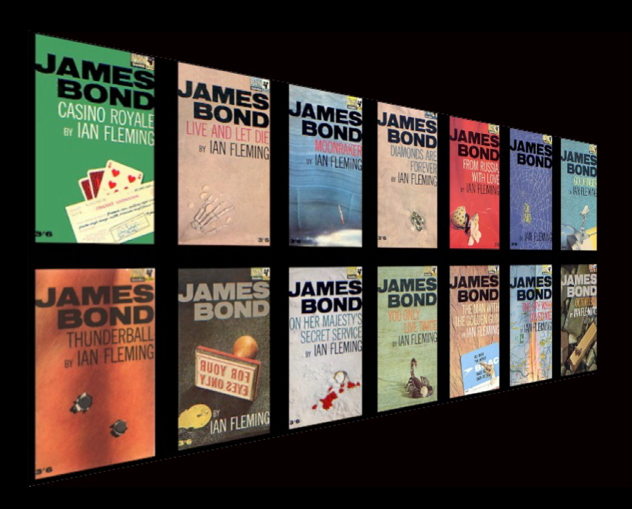
ALR: Was that how Hawkey came to design the famous paperback cover for Thunderball?
 EMO: No. That happened because Harry Saltzman, co-producer of the early Bond films, was impressed with Ray’s jacket for Len Deighton’s first novel, The Ipcress File – the rights to which Saltzman acquired around the time Dr No was released in late 1962.
ALR: That’s the monochrome photographic jacket that had everyone talking?
EMO: That’s right. It was shot on a half-plate camera using high-key lighting, which at the time was very much in vogue for taking upmarket fashion photographs. Saltzman liked the stark contemporary design and prevailed on Aubrey Forshaw, chairman of Pan Books, to commission Ray to redesign the paperback editions of the Bond novels, which were looking increasingly dated.
ALR: Did Saltzman have any contractual say on the covers?
EMO: I don’t believe so. But he knew the books and films would become mutually dependent. We know Ian Fleming liked Ray’s work, and they’d met socially too. In March 1963, when Peter Evans hosted the private lunch at London’s White Tower restaurant that brought Fleming and Len Deighton together for the first time, Ray joined them afterwards. There’s a great photograph of the occasion by Jack Nisberg, the American freelance reportage photographer, who was on hand to record the event.
ALR: So Hawkey’s designs for the paperbacks happened in lockstep with the arrival of Bond on the big screen, a significant milestone in the Fleming chronicle.
 EMO: Certainly, and yet at that stage nobody knew what a commercial powerhouse the movie franchise would prove. Hawkey created his design for Thunderball only weeks after the opening of Dr No and before the final screenplay for From Russia With Love had even been delivered to Saltzman and Broccoli. He immediately proposed the name ‘JAMES BOND’ should be elevated above the title – where it remained for nearly four decades.
He made it twice the size of the book’s title and Fleming’s name, anticipating the development of the branded hero that would become the hallmark of the movies. The cover also broke new ground in having simulated .38 calibre bullet holes die-cut into Brian Duffy’s cover photograph. Published in May 1963, it was the largest first printing of a James Bond title to date – 350,000 copies. Three quarters of a million copies of Thunderball were sold that year alone.
ALR: Fleming must have been delighted!
EMO: He told Hawkey it was a brilliant cover. I think Fleming was quick to recognise the importance of giving the paperbacks a contemporary look.

Bond on the Beach – Photo: Alan Tong
ALR: Hawkey’s design was then replicated across all Fleming’s Bond titles?
EMO: It became the prototype for all the subsequent Pan paperback editions that didn’t receive the movie tie-in treatment. 80 million copies using Hawkey’s design format were sold between 1963 and 2001.
ALR: Did Hawkey have any further involvement with the Bond books?
EMO: Jonathan Cape commissioned him to design the cover for The Book of Bond, which Kingsley Amis wrote under the pseudonym Lt.-Col. William (“Bill”) Tanner – a character in the Bond novels. In keeping with the book’s tongue-in-cheek tone, Ray designed a reversible pop-art jacket, so it could be read ‘in the field’. One side showed the correct title, the other The Bible Revised to be Read as Literature – a parody on Bond’s use of a hollowed-out copy of The Bible Designed to be Read as Literature to conceal his Walther PPK in Goldfinger. Ray also designed the Pan paperback editions of The Book of Bond and Amis’ Colonel Sun.

ALR: In addition to Deighton and Fleming, Hawkey designed jackets for many other best-selling authors. One can recognise a definable ‘Hawkey’ style that gives a narrative dimension to the covers.
EMO: Yes. Authors like Freddy Forsyth, John Grisham, Elizabeth Jane Howard, Iris Murdoch and many others. Collins commissioned him to redesign all Agatha Christie’s covers, and his jackets were so effective that apparently Penguin’s Chief Editor Tony Godwin felt their celebrated paperback crime list could no longer compete.
ALR: What was his design philosophy?
EMO: The late John Marshall interviewed Ray for TOWN magazine, and quoted a lecture that he gave to the Design and Industries Association that consisted of just four sentences. “The graphic designer’s job is to help persuade a specified group of people to buy his client’s merchandise or service, or adopt a general attitude that is in some way beneficial to his client. In order to do this successfully the graphic designer must have a thorough knowledge of applied psychology and be prepared and able to plunder the fine and decorative arts for his techniques. He should at all times act as though he had an actual financial stake in his client’s enterprise beyond his own fee. If a graphic designer doesn’t accept this as his creed I believe he should turn in his button-down shirt and become a painter.” There you have it. That’s what made him one of Britain’s most successful graphic designers. In fact it reached the point that new Hawkey book jackets were themselves reviewed in the publishing trade press!
ALR: He continued to work in Fleet Street while designing all these jackets?
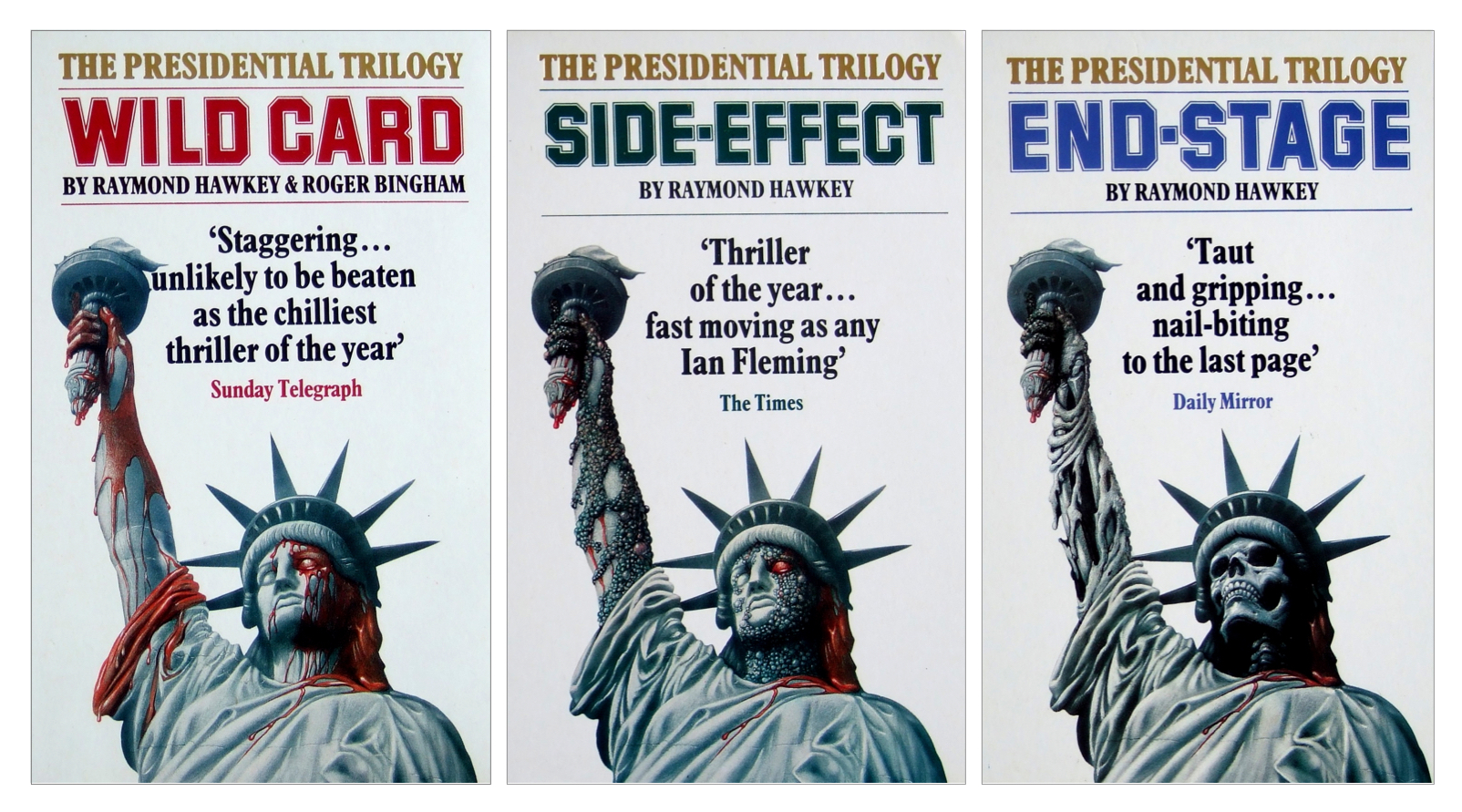
EMO: In 1964 he joined The Observer as Presentation Director, where he remained for eleven years. And after that he combined graphic design with a second career as a best-selling author with three extraordinary novels including It, in which the Americans attempt to raise the ghost of a dead Russian defector so that they can debrief him, but are unprepared for the horrifying consequences . . . An unputdownable story!
ALR: I must find a copy!
EMO: The three were later republished as The Presidential Trilogy, and It was re-titled End-Stage.
ALR: Newspaper design, magazine covers, book jackets, advertising, film titles, novels… plainly there’s much more of Hawkey’s legacy to explore. I’m surprised there hasn’t been an exhibition pulling this all together.
EMO: You’re right, one is overdue. Ray Hawkey’s influence is widely acknowledged by generations of designers. They say great graphic design, like great art, remains relevant beyond its time. Perhaps we can make an exhibition happen.
Incidental Intelligence
Raymond Hawkey (2 February 1930 – 22 August 2010). Graduated from the Royal College of Art, 1953. Art Director, Condé Nast Promotion Department, 1953-54. Art Director, Vogue affiliated magazines, 1954-57. Art Director, Colman Prentis & Varley, 1958-59. Design Director, Daily Express, 1959-64. Presentation Director, Observer and Observer Colour Magazine, 1964-75. Promotion adviser to Len Deighton, 1960-88. Designed jackets for Len Deighton, Ian Fleming, Kingsley Amis, Eric Clark, Frederick Forsyth, John Grisham, Elizabeth Jane Howard, Desmond Morris, Iris Murdoch, Ruth Rendell and many others. Designer of the titles for the motion picture Oh! What a Lovely War, 1969. Author of Wild Card (with Roger Bingham), 1974; Side-Effect, 1979; and It, 1983 (published by Sphere as The Presidential Trilogy, 1988); and Evolution: The Story of the Origins of Humankind, 1986. Winner, Vogue Talent Contest, 1953; Winner, Newspaper Design Award on behalf of the Observer, 1968 and 1969; Winner, Mystery Writers of America Bookjacket Design Award, 1976.
Edward Milward-Oliver (@EdwardHMO) has spent most of his professional life in the fields of media and communications, and has served on the boards of a number of public companies. His online arts network Amity is currently in ‘stealth mode’. Edward is a published authority on the life and work of Len Deighton.
Len Deighton Lunches with Ian Fleming
The Rolls Royce of Comic Strips: James Bond in the Daily Express


What a fabulous article!
Raymond Hawkey was an absolute genius.
Fleming was so fortunate to have both Chopping and Hawkey design for him. He had the best of both worlds and in a strange way, Chopping was absolutely right for Fleming’s up market Jonathan Cape editions whilst Hawkey gave PAN the modernity and flair that took his books to a whole new generation.
It’s worth mentioning that back then, hardback and paperback readers were very different audiences. Books weren’t discounted and there was a huge price differential between the two. In addition, there was a two year gestation period between the hardback launch and it appearing in paperback and this was rigidly adhered to by publishers. As a consequence, the hardback purchaser tended to be the more affluent connoisseur whilst paperbacks were purchased by a more mass, younger audience. The Chopping / Hawkey combination covered both bases perfectly and made a huge contribution to sales.
That said, my favourite book art of all time is Hawkey’s cover for ‘The Ipcress File’.
It was an unbelievable piece of work that grabbed completely the zeitgeist behind Deighton’s novel and changed the nature of book art forever. It was just so damn cool (when that word actually meant something) and it was also, to the best of my knowledge, one of the few cover arts that was used both for the hardback (Hodder) and paperback (Panther).
Great stuff and it is such a shame that we don’t have work of remotely that standard today.
Yesterday, I purchased a beautiful Deighton first edition of ‘Ipcress’ . Much as I love the novel, I was driven to do it because of Hawkey’s art!
Len Deighton is the first to acknowledge the debt he owed Ray Hawkey, as he told me recently. “Ray’s respect and delight in the use of black and white patterns and an underlying reference to film noir with its hard contrast lighting, created a unified look to my first three novels that contributed enormously to their success.”
Ray’s jacket design for IPCRESS was also used on the US first edition (Simon & Schuster), and the French first edition (Laffont).
Nice to know. Deighton is a great guy – he really is the Dickens of our time. I just adore his work.
Wonderful, wonderful article. In the 60’s when I first started seeing and reading the Bond’s it was the Hawkey editions I read. So evocative of their time and my childhood. Part of my inspiration to become a graphic designer.