Article by Graham M. Thomas
According to Robert Harling, the main topic of conversation when he first met Ian Fleming at a party in 1939 was typography; Fleming mentioned that he subscribed to Typography, a magazine that Harling edited. ‘I’ve been a subscriber to your magazine with its singular title from its very first number,’ Harling was to recall Fleming saying when he wrote his memoir.
More than that, Fleming asked Harling to improve the typography of various Admiralty journals including The Weekly Intelligence Report while admitting that the remuneration would not be generous. This was in 1939, a month or two before the outbreak of the Second World War. Thereafter the two were to remain friends until Fleming’s death.
Fleming was already a serious book collector by the time he and Harling met, and it is clear that he had more than a casual interest in printing techniques and typography. (He was to lend 24 books to the Fitzwilliam Museum’s exhibition of printing held in 1940 to mark the quincentenary of Gutenberg’s invention.) A decade later, Fleming’s contribution to book design was recognised by the Royal College of Art when he was elected to the governing council in the mid-1950s.
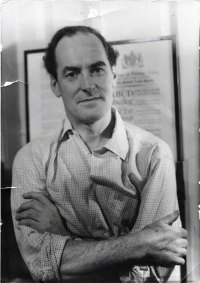
Robert Harling enjoyed a long and distinguished career in design and typography, one that before the war included a stint at Stuart Advertising, recognised as one of the foremost design led agencies of its era, and immediately after the war he was in charge of the creative department at Everetts, another advertising agency in London. Fleming had then taken him on as a typographic consultant for the Sunday Times, and Book Collector; later he arranged for Harling to be employed fulltime as editor of House & Garden.
When it came to the design of the Bond dust jackets, Fleming was responsible for the design from the very first. Having decided on the concepts, he asked Kenneth Lewis, an artist in Kemsley’s Visual Features department, to illustrate the first three. With Diamonds Are Forever, Fleming developed the design with Pat Marriott. In all four instances, Harling helped Fleming in the choice of typeface: with the first two books he used Victorian style typefaces, with Moonraker a sans serif quasi-stencil style, and with Diamonds Are Forever, a typical 1950s script that would have been familiar from fashion advertising of the time.
© Ian Fleming Bibliographical Archive/Jon Gilbert
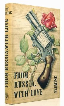
However, the iconic and most memorable dust jackets started with the fifth book, From Russia With Love. The decision to yet again change the design was made because the consensus of opinion within Cape was that while sales were growing exponentially, FRWL was a significant improvement in Fleming’s writing and that even bigger sales should be expected. To help announce what might be called a new chapter in the series, it was decided that a more striking dust jacket was needed. Again Fleming created the concept before commissioning Richard Chopping to paint the illustration to Fleming’s own tight brief – while ensuring that he allowed space for the title and author’s name.
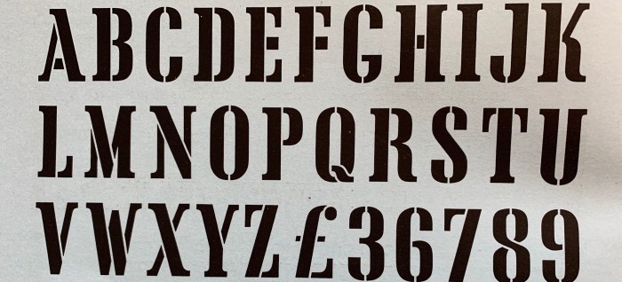
Each of the previous books had used a different style of font. This time Harling recommended yet another font called Tea Chest, one that he had designed in 1939 for the foundry Stephenson Blake.
When Stephenson Blake launched it they described it thus:
‘Tea Chest. Available in 72-pt (60 and 48-pt sizes in preparation.) This is the most adventurous type yet essayed by Stephenson Blake in their policy of producing novel and unusual display types for the advertising market…Tea Chest is the first commissioned type. It should have popular appeal, for it is black and condensed. Most stencil types suffer from avoirdupois in a high degree. These characters are amusing. The heavy cross-strokes are not out of harmony with the general feel of the type. The K, R and Q, usually most difficult characters in a stencil type, are sound and interesting designs. The M is probably the least successful character.’
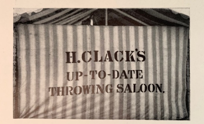
Harling had already designed a number of typefaces for Stephenson Blake but his interest in a stencil font can be seen from an article he wrote for Typography in early 1939 where he reflected on the use of typography in signage. Within the article is a photograph of H Clack’s Up-to-date Throwing Saloon, and he writes,
‘The quiet sound forms of the stencil character on the ‘Throwing Saloon’ are of particular interest, in view of the rarity of this form in sign-writing practice.’
A throwing saloon was traditionally a large tent where wooden balls were thrown to dislodge coconuts, and the Clack family (and this might be Henry Clack) were well known in the fairground fraternity.
Voila. It all started with Harling discovery of Mr Clack’s tent.
 Up until the late 1930s, stencil designs were all but non-existent as commercially produced fonts. The first came in 1937 when a font called Stencil was developed by Ludlow Typography in the UK, and then another stencil style was created in the US by American Type Founders. In the US, one of its earliest known uses was in 1946 on the front cover of Graham Greene’s novel Ministry of Fear – in the US Penguin edition, with artwork by Robert Jonas. It was also a favourite of the designer Alex Steinweiss, who chose it for several Columbia Records sleeves covers in the 1940s.
But it was still not a widely used typeface so when it featured on the From Russia With Lover dust jacket it caused a stir because if its informality. This though is the great strength of Fleming’s design: the beautiful and classic Trompe L’oeil illustration by Chopping in stark contrast to the rough boldness of Tea Chest.
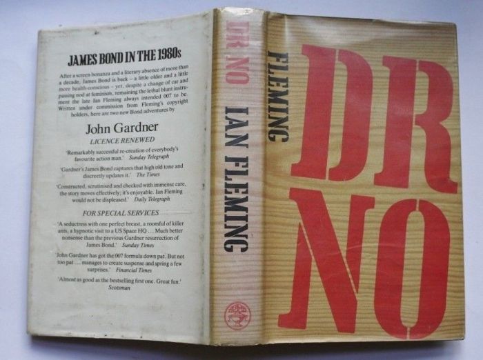
Thereafter, Tea Chest became part of the house style in the UK editions albeit with a couple of inexplicable lapses with Dr No*, and For Your Eyes Only.
[*Dr. No was re-released with the famous Tea Chest font by Jonathan Cape in 1983.]
Bibliography:
Ian Fleming: a Personal Memoir. Robert Harling. Robson Press, 2015.
Typography: 8. Edited by Robert Harling, Shenval Press. 1939
Incidental Intelligence
The Artistic Legacy of Richard Chopping
‘Exceptionally non-boring’: Robert Harling’s Memoir of Ian Fleming


I downloaded a version called ‘Cargo Crate’ and then spent an agonising couple of days trying to ‘stencil’ it onto a sheet of pine for my ‘Bond bookshelf’. It looks a little messy up close, but from a distance, you can’t see the imperfections in it. Three coats of varnish and it turned out a tad better than I expected.
And yes, I agree that it’s an iconic font, because it conveys images of weapons crate stenciling, exotic teas from faraway lands, military equipment stenciling (slightly).