Since 2010, Gerry Wadsworth has been painting in watercolor and for the past two years has been working on “An Homage to James Bond” – a series of visual interpretations of books of Ian Fleming and the James Bond films. We welcome him in from the cold to answer to debrief.
What ignited your passion for creating an artistic “An Homage to James Bond”?
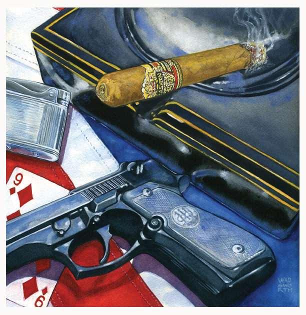
It had to be the definitive performance of Daniel Craig as Bond in Casino Royalé. The Fleming original is still my favorite book and despite the modernization of the storyline for the movie, I was completely hooked from the opening scenes of parkour speed running to the last frame of the movie. When Bond confronted Mr. Smith with a suppressed Heckler & Koch UMP-9, I thought, I can do this, I can paint my own interpretation of the books. And, my watercolor teacher wonʼt be there to pull the brush out of my hand and tell me, “Gerry, youʼre finished, just sign your name.” Which became a mantra in my class. So my first painting was Casino Royalé, with Bondʼs winning hand of cards that beat Le Chiffre, the ubiquitous Morlands cigarette in a crystal ashtray, a vintage lighter, and his Walther PPK. The title of the painting came from the Gypsy quote about the cards…A whisper of love, a whisper of hate. I have to admit, one of the cards is the wrong suit and color, but one must allow for some artistic license…

Casino Royale – “A whisper of love, a whisper of hate” … in which Bond and the villain Le Chiffre engage in a life and death game of Baccarat. Dealt the two red queens against Le Chiffre’s king and three, Bond’s fate rests in his next card. He draws a nine – the card known in gypsy magic as “a whisper of love, a whisper of hate” – a card that meant almost certain victory for Bond. Le Chiffre draws a five, thinking that he has won. The croupier flicks Bond’s cards over – “Et le Neuf” – and “le baccarat” is Bond’s. Le Chiffre goes down in defeat with a loss of his personal fortune, sealing his death warrant at the hands of SMERSH.
 After the film, I went out and bought all the new Penguin books, searched local antique and book stores for earlier versions, dreamt about finding an untouched First Edition, and started assembling as many cool props that I could find – and afford.
Now my studio has a PPK (blank version), a real Fairbain-Sykes commando knife, a selection of crystal ashtrays for cigars and cigarettes, empty champagne bottles, an old box of Playerʼs, two humidors with a collection of cigars (I donʼt even smoke…), a wicked Japanese WW2 long sword in military mounts, a gold lighter, my dadʼs Ronson “Adonis” lighter, various period antiques and silver, and a growing pile of reference material and notes for the books I havenʼt reread nor the paintings I havenʼt started.
I am always on the lookout for “stuff” that is just right to convey a certain mood and could be used in a painting.

Gerald’s Home Studio
Connery and Craig are my two favorite actors for Bond, followed by Timothy Dalton and then George Lazenby. I really didnʼt like the spoofing, tongue-in-cheek interpretation of Bond by Roger Moore, and the other-worldly good looks of Pierce Brosnan was a distraction from the cold and clinical tough-guy looks that described Bond in the novels. As a result, the two portraits I have completed are of Connery and Craig. I painted them in the manner of the Dutch artists of the 17th century – lots of chiaroscuro shadowing and lighting to make the faces emerge from the dark backgrounds. I used a combination of wet and dry brush to create skin tones and facial details. The paintings are circular, about 17” in diameter, and too big to scan, so I donʼt have a good high resolution scan of them yet. In fact, I am reworking them a bit – I was somewhat premature in getting them matted and framed – and I feel that they need a bit more work before they can be shown.
The Craig portrait is called “Damaged Goods” and he sports a bloodied lip – to show his vulnerability and make him more human – but not quite humane. He does, after all, have a license to kill.

Daniel Craig portrait: called “Damaged Goods”
You clearly have done a lot of research for the paintings; what is your process for painting them and how did you decide which ones to paint?
Before I begin a painting I quickly read and skim the chosen novel for imagery, words, scenes, characters and their relationship with Bond, to see if that gives me a mental picture that makes sense, and captures the feel of some aspect of the book. I have moved the books that I have turned into paintings and separated them from those that are unread, so when I start a new painting, I blindly pick a book and give it the once over. Sometimes something grabs me, or not. If not, I quickly move to the next book, and not in any particular order. I am really trying to avoid visual clichés or piggybacking on otherʼs artistic interpretations, so the visual trigger could be something as simple as a chapter heading – Goldfinger – Reflections in a Double Bourbon, or in You Only Live Twice, the dinner scene with Tiger Tanaka, where Bond was given his first taste of Fugu – in which he moodily reflects upon life and death and how Dr. Shatterhand is providing the means to kill off suicidal Japanese in his toxic Garden. In that painting I created Bondʼs Bento-Box of deadly treats – with a large dose of liberal creativity.

Goldfinger – “Reflections in a Double Bourbon” … in which Bond reflects moodily over life and death and the last man he dispatched – as part of his profession to kill people. It had been a squalid affair, dangerous and without any redeeming features – but Bond did as he was told. The death of a Mexican narco-trafficer smuggling heroin into Britain had to be stopped at all costs. Bond parries the knife strike and with a Commando blow to the chin and throat, sends the drug dealer to his death. Bond gloomily orders another double bourbon with the full intention of “getting stinking drunk” whilst waiting for his flight to Miami.
Once I have a mental visual, I make rough sketches of the layout, and use my set of “Golden Mean” calipers to divide the paper into quadrants of focus or forced focus, and determine how the elements of the painting will fit within those quadrants. I like to have edges of things touch or slightly overlap, have curved areas intersect with other curves, so that the eye is moved through the painting. I enjoy directing oneʼs attention to a certain part of the painting – the so-called “sweet spot” that renaissance artists took pleasure in using – so I will make sure that some small detail of the image stands out at that intersection. Then I gather my reference material and make a very detailed drawing in light pencil. If everything comes together – not frequently – I erase and correct the drawing until I am satisfied with the overall look and feel. Does it make sense? Does it convey the mood or story line of the painting and how does that connect with the book?
After that, I clean my color palette thoroughly and select the range of colors I feel will compliment the imagery. I wash out brushes, sharpen pencil leads, generally prep the workspace and remove any visual distractions. Watercolor is a insanely unforgiving medium and once you commit to a stroke or wash of color, thatʼs final. Itʼs sink or swim. I have tried to wash off mistakes in a painting (in the bathtub) but it just doesnʼt give a satisfying result, and in most circumstances, it ruins the surface of the paper completely. I work mainly from light to dark, wetting areas that need to flow and blend with other colors, or dry where I need a hard and distinctive edge, detail or intensity of color. But I do jump around a bit with colors to set up contrasts and soften or redefine edges that need a certain emphasis. Once I am satisfied, I call in my wife to give me her impremature of objectivity. If approved, I scan the painting for my archive, website and digital prints.

You Only Live Twice – “Dr. Shatterhand’s Banquet of Death” … in which Tiger Tanaka, Head of Japanese Secret Service, and Bond, enjoy an “o-furo” – the traditional and honorable sulphur bath, get blazing drunk on five bottles of Saké each, trade Haiku poems, share the secrets of Dr. Shatterhand’s poisonous Garden of Delights, and eat a deadly blow-fish – “Fugu” – for dinner. Bond, relieved that he survived his meal, ponders the popular dish for suicides and murderers and remarks that it’s “just what he would have chosen” for his last meal. Meanwhile, on an island off of Fukuoka…
Then I sit on the painting for a few days to see if my impressions of it are the same as each time I look at it anew. I will often pick up the brush and make some correction or addition to a detail, or rework parts of the painting, but I am chastized if I do so…my best critic has spoken! Then I take the work to my framer and get the painting decked out in a gunmetal gray (of course!) colored wooden frame with a very thick, bright white matt to make the art jump off the wall. Then I take a mental break, and try to get motivated for the next undertaking. I am currently coming out of a hiatus of Bondian accidie…or procrastination…and am eagerly looking forward to the next visual adventure.
When and how did you become a literary Bond fan and what are your favorite Bond books?
 I was introduced to the Bond series by my favorite Uncle, who epitomized (in my eleven year old eyes) everything that was cool, suave, chic, and manly in 1962. He had a certain élan and oozed elegance – his bearing was something to behold and women found him irresistable. He smoked continuously and used a classic, solid-gold Dunhill lighter to light up his cigarettes. He drove the latest Cadillac Coupe DeVille convertable that he purchased new every year. Black, of course. Had a membership and Key Card to the Playboy Club. Knew his wines and bourbon, whiskeys and mixed drinks. His Chicago high-rise “man-pad” apartment was quintessential 1960ʼs high fashion. He was an ex-Marine Corp, Pacific Theatre, field hospital corpsman, and at over 6ʼ tall, had the unmistakable physical presence and imposing bearing that demanded respect, as well as your immediate attention. To me, he was James Bond.
I just thought he was the coolest guy on the planet. He gave me the paperbacks as soon as he was finished with them…Casino Royalé was the first – and my mother was appalled! Too much “ess-ee-ex” and violence for my young and formative mind…and I never looked back.
I am still very partial to Casino Royalé because of my uncleʼs influence, and as a kid, bought John Scarneʼs Book on Cards and card cheating to learn the techniques of sharping, shaving, skimming, bottom-dealing, shiners and the incredibly useful single hand cut. I could beat the pants off my cousin who was as egregious a card cheat as I was…It was the pure manifestation of literary fantasy come alive.
Quantum of Solace – “A Pair of Nines” … in which Bond puts a stop to arms being smuggled from Jamaica and the Bahamas to Castro’s rebels in Cuba – a job he didn’t relish, as his sympathies were with the Cuban rebels. At dinner with the Governor of Nassau, while enjoying brandy and Cuban cigars, conversation drifts over the complexity of human relationships and the common factor in all relations…the Law of the Quantum of Solace…upon which all love and friendship is based – the Comédie Humaine, where human passions are raw and real.
My interest in all things Japanese was directly influenced by You Only Live Twice. On Her Majestyʼs Secret Service gave me added impetus to research my own familyʼs genealogical history, and as I am unquestionably the family historian, dusty letters and old photos have become the bane of my wifeʼs existance. Moonraker with the dasterdly Hugo Drax and his Werewolves would be next, followed by Diamonds are Forever, Goldfinger, From Russia with Love, and Thunderball, more or less in that order. But nothing is a constant, and as I reread them, I find added aspects of the stories that my youthful mind didnʼt quite comprehend, and I gain some new-found understanding and clarity in the writing, brought forth, hopefully, by age, experience, and a dose of wisdom. The added bonus is that they are still a damn fine read. From a View to a Kill is as tight a story as the best Hemingway, and that will probably be the next painting after The Hildebrand Rarity is completed.
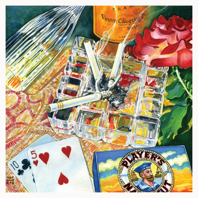
Thunderball – “Cardboard Hero and the Spectre of Defeat” … in which Domino, drinking Veuve Cliquot champagne, reveals to Bond that her “Hero” – the Sailor on the pack of Player’s Navy Cut cigarettes – was her one true love, the man of her dreams, the first man she ever sinned with. …in which, Emilio Largo and Bond, playing Chemin de Fer for high stakes, spar in a battle of words. Bond casually remarks that he saw in Largo, “a spectre of defeat” – words that strike Largo with their double meaning – and Bond defeats Largo with the ten of clubs and the five of hearts.
Do you have influences from the various Bond book jacket artists of the past?
The Bond books that my uncle gave me had understated covers – unfortunately, my favorite illustrator of all time, Frank Frazetta, didnʼt do Bond, so I expanded my collection of Edgar Rice Burroughsʼ books, instead. The newest book covers from Penguin Books are excellent, but since I am really trying to avoid any overt visual references, or worse, some typical visual cliché that one might expect to see from a particular story, I try not to be influenced by other illustratorsʼ personal interpretations and their art. That makes the subject matter a bit more difficult to deduce, and I find that I have to rely upon some unusual texual references or dialogue to give me visual clues, and push the narrative along.

James Bond Penguin 2006 Covers
How can people buy your paintings and are you planning any more?
I am planning to complete all the books and short stories, a few more portraits (with a sexy select female counterpart or opponent), a number of paintings that reflect the overall Bond oeuvre – like my “Mʼs Directive” – and also some paintings based upon select movies.
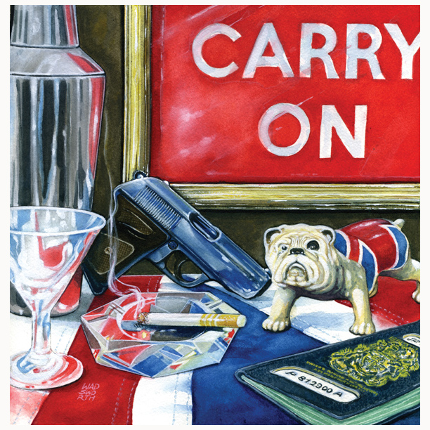
M’s Directive: “Carry On, Double-Oh-Seven”… in which the object’s of Bond’s daily life are exhibited throughout all his assignments and stories, and with which he must carry out the responsibilities of his 007 – License to Kill – status. A vodka martini – shaken not stirred. A Walther PPK, 7.6 mm, with a “delivery like a brick through a plate glass window. Takes a Brausch silencer with very little reduction in muzzle velocity. The American CIA swear by them.” His passport – always in his own name. And the ubiquitous cigarette – custom made by Morlands, with three gold bands and a blend of Balkan and Turkish tobacco.
Skyfall is a case in point. I enjoyed the movie immensely and thought that because the Aston Martin DB5 was such an integral and iconic part of the books and movie imagery, that I should combine it with his ancestral home, Skyfall, going up in flames.
A neighbor was an influence as far as the narrative, or backstory text, was concerned. He spoke of personal sacrifice, giving up oneʼs home and family history for the greater good, and as we spoke, I realized that “Sacrificed for Queen and Country” was going to be the title and would direct the narrative flow.

Skyfall – “Sacrificed for Queen and Country” … in which Bond sacrifices his ancestral home “Skyfall” in an attempt to save M’s life, only to see his Aston Martin DB5 destroyed by Raoul Silva, ex-MI6 agent-turned-cyber terrorist, and M mortally wounded. As Skyfall burns to the ground, Silva drops to the floor with a knife thrown by Bond, M, too, collapses and dies in his arms. Back in London – days later – Bond’s new boss, Mallory, queries Bond about his mental and physical state and his readiness to carry on as a “double-ought” agent.
I am currently working on a large scale painting from The Hildebrand Rarity short story that will be a “cabinet of curiosities” – again, in the manner of the Dutch painters of the 17th century – but with elements that reflect the protagonist – and antagonist – Milton Krestʼs preoccupation with scientific discovery for tax write-offs, his lust for power and wealth, his Germanic Prussian ancestry (“the old Hun again…always at your feet or at your throat”), and his five wives…the last one being his final victim of abusive behavior before his own demise.
The original paintings are not up for sale – until I can arrange a one-man show somewhere here in Richmond. I envision artistically (aka scantily-clad) young female bartenders offering up flutes of Veuve Cliquot champagne, vodka martinis (shaken not stirred) and cigars (Cuban, if weʼre lucky); a Shirley Bassey sound-alike singing Goldfinger and other movie soundtracks; video monitors with looped clips from the movies; two lifesize gold-painted mannequins forming an arch at the main entrance and holding Walther PPK’s in their hands; and a mandatory opening night dress code of tuxedos and other formal wear for select guests.

For Your Eyes Only – ‘Never send a man where you can send a bullet’ … in which Bond goes clandestine and “off the record” to find, identify, and deliver final judgment upon three hitmen and their boss, Von Hammerstein – an ex-Gestapo thug, turned head of Counter Intelligence for Batista – who had murdered close personal friends of M in Jamaica. Bond mulls over his assignment – he had no personal motive – it was just his job, as it was the job of a pest control officer to kill rats. He was the public executioner appointed by M to avenge the victims…
There’s a gallery here in town with the perfect name: the Bond Gallery. You couldn’t make up a better marketing lure than that name! And, what could be more tempting than “Bond at Bond!” I owned and operated an art gallery in Mystic, Connecticut in the 70’s, so I wouldn’t be surprised if the Bond Gallery is booked solid until some date in 2016 – which would give me sufficient time to finish the series, as well as prepare for the “must-see show of the year!” Weʼll see…
I am offering for sale archival digital prints of all the work completed to date (except the portraits) that are full-size, numbered, titled and signed, and can be purchased directly from me, via my email address. The prints, including postage to anywhere in the continental US, are $45 each. End of self promotion!
Incidental Intelligence
 Gerald Wadsworth is an award-winning graphic designer with over 40 years of advertising, graphic design and fine arts experience.
From 1973 to 1990, he owned a five person ad and design firm in Mystic, Connecticut, with over 70 clients in New England. In the mid 1970’s, he owned and ran the 47 Holmes Street Gallery, that provided an alternative venue for artists to exhibit and sell their work. While operating the gallery, he worked as a muralist for Connecticut’s first CETA Arts Program, and designed and executed large-scale murals for the City of Norwich Public Works Department, The Backus Memorial Hospital Children’s Ward, and more.
Archival digital prints (US $45) of his paintings are available directly from Wadsworth by contacting his email address: g.wadsworth@verizon.net
View his work at Wadsworth Fine Art


What a great article and what fabulous paintings!
I particularly liked the ‘Casino Royale’ homage albeit I’d have liked it even more if it had featured the unfiltered Moreland with the gold rings, a Beretta .25 with a taped skeletal grip and an oxidised Ronson – only kidding — artistic licence can always be renewed.
Seriously great work.
Thanks, David, for your feedback and praise! I always forget to have the unfiltered Morlands in the paintings – must be some holdover from my Dad smoking unfiltered Camels during breakfast, lunch and dinner when I was growing up. I barely survived the smoke! I thought seriously about the Beretta with skeletal grip, but I liked the design and shape of the PPK more, from a graphics perspective, and I didn’t get my dad’s old Adonis “Ronson” lighter until after he died, so this painting had a vintage mother-of-pearl-sided lighter by A.S.R. company.
Amazing paintings! I purchased one directly from the artist and have it framed in my study — in an effort to bring a little espionage to my working life. Great interview, too. I think I will have to reread the Bond books now!