This month we are delighted to talk to the San Francisco based artist Michael Gillette, who created a beautiful set of officially licensed James Bond book covers for the Ian Fleming Centenary in 2008, that was published by Penguin Books.
1. What is your favourite Chopping cover and why?
I really enjoy them all, Chopping established many Bond archetypes. Thunderball has real power to it, with the hand and dagger. Octopussy has that nice surrealist edge to it, which is unexpected in the Bond world.
2. How did you come to do your set of covers for Ian Fleming Publications; what was your process and inspiration and do you have a favourite?
I was contacted by book designer Jon Gray, (Gray318) and asked if I was interested in doing something “James Bond-esque” for Penguin.
“YES!”
I’d known Jon for a while: he was at the London College of Printing whilst I was at Kingston, and we had mutual art school friends. He sent me an image of the original Casino Royale poster and asked if I could develop the idea into a full set. It was clear at this point that it was for the Fleming titles.

Original 1967 film poster for Casino Royale – Artist: Robert E. McGinnis
As a test, I was asked to try Casino Royale. I started sketching, below are a couple of roughs. The 3rd one here was accepted as finished – it even made it on to a first-day stamp cover, but by the time I’d completed all the other titles, I knew it could be mightily improved, so I did it twice.
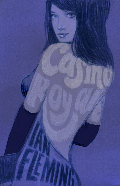
© Michael Gillette
Once the Casino cover was green-lit, I started working frenetically on the others. I decided that each cover should have its own colour theme: I felt that they would display really well together as a rainbow of hues. I also decided to avoid guns as much as possible, and that the nudity had to be discreet.
I can’t remember the order I did them, but Goldfinger was fairly early on, and I felt that set the standard. I had about 6 weeks to finish them all. I completed at least two a week. I didn’t have time to plan them all out as a set: I’d pick a title and colour and get cracking. The girls were painted in watercolour, then tinted on the computer. It gave me the flexibility to balance the colours at the end- invaluable.

© Michael Gillette
With the girl complete, I’d work on the type. This often took longer than the painting! The type was hand-drawn then polished almost endlessly in photoshop. Here, the influences were Saul Bass, 60s film posters and psychedelic typography (I made them in San Francisco after all!)
As I progressed, the colours got harder to work with. Thunderball was particularly tricky: green is not a good skin tone.
I re-did that cover some years later, it’s the only one I was disappointed with. The Penguin set was printed un-proofed and the colours were often flatter than hoped. Working with a gallery to create the prints as envisioned has been wonderful.
I was getting sporadic feedback from John Hamilton (RIP) legendary Penguin Art Director, suggesting colours, and general calls to “hurry up!” The Ian Fleming estate would occasionally chime in too, but I felt their cues were good. I recall they sent me a passage describing Honey Rider in Dr No: her skin colour is noted as caramel, and that she possessed the bottom of a schoolboy!

I’ve lived with these covers for over ten years, and I see them often whilst signing prints etc. I’m really happy how they have held up. I think some magic was in the air! Some of them went on to multiple languages. They have had a life of their own.
I do have a soft spot for the Moonraker cover. The mirror creating a moon face works nicely.

© Michael Gillette
I do really love mid-century design. Paul Rand, Milton Glazer, Sister Corita Kent spring to mind… they are all in my DNA by now. I follow an Instagram account of a college friend @neue_miller: he collates many great book designs from the first modernist era. Currently, book design seems to be a dying art, it’s not surprising, as the fees stalled sometime in the 20th century. Hiring an illustrator is often a pay stub too far, it’s a great shame. I will say, that Jon Gray is still fighting a very good fight! I think that’s where we came in.
3. When did you read your first Bond novel and which is your favourite?
When I was 12 we moved to a house where I had an attic room. In a cupboard under the eaves were all my father’s collection of Bond books. He always told me the books were completely different from the films. They were the Pan paperback covers with the photographs. I really love those covers, maybe in part because they were the ones I first read. They are a little cooler than many of the pulpy covers and have aged well because of that. They are definitely in the lineage of Chopping. Moonraker is still my favourite read.
4. Do you have any favourite Bond dust jackets in paperback or by continuation authors?
 The Pan paperback of Live and let Die, with the bones and coins in the sand. It’s so minimal but very powerful. It’s that Chopping effect! I did many of the continuation covers myself, but they didn’t work out the way I’d envisioned – too pulpy. It took me a while to figure out that an entirely different approach was required. I enjoyed reading Colonel Sun by Kingsley Amis/Robert Markham. I’m from Swansea, where Amis lived for a time, so there is that connection. I wish he’d done more.
5. What are you working on next?
This last summer I completed a second set of Fleming Bond covers, (it will be a while until they see the light of day, but I’m happy with them and keeping my fingers crossed!) Early on in the process I had explored the idea of remixing concepts from past Bond artists and bringing them up to date. I chose the Goldfinger cover from Chopping, but realized it wasn’t going to be bettered, so I changed my direction and went with all new ideas.
The second set I’ve been working on recently is very different from the Centenary Edition. It took a while to find a direction that was cool, appropriate and different from what had already gone before.
I then set myself the task of really limiting some of the archetypes that had been used before. This was quite a challenge, but in the 21st century, I think it’s important to reflect the times. Bond is such a multi-faceted folk hero at this point, that much of his original character from the books has been mightily enhanced. I can’t think of another figure in the whole of popular culture that has become synonymous with such a range of different characteristics; from Super-luxury and sophistication to bravery and duty, with much in between. That’s part of the reason why I’m so excited to do the covers, there is so much cool history to draw from, and although those printed words remain the same, our concept of Bond is continually evolving, and I ‘m an artist that likes to shift styles.

Michael Gillette hard at work
To do exactly the same covers in entirely different modes is a great challenge, and it’s taken me a while to come to a direction that I’m really happy with. I enjoyed learning about Chopping on your site, I can understand his frustrations with being so tied to the Bond world.
James Bond has become a very welcome part of my life. I’ve been told that I’ve done more covers for Bond than any other designer! 007 has an ability to continually evolve and remain relevant to the times. He is synonymous with so many different qualities, from high luxury to vengeance- it’s quite a spread! It allows for an endless spectrum of design approaches, even though the printed words remain as Fleming left them.
Incidental Intelligence
Originally released in 2008 to celebrate the centenary of Ian Fleming’s birth, Michael Gillette’s designs for the covers of Penguin’s Fleming Bond novels were an instant iconic classic. Much requested, they are now available as limited edition, signed and numbered prints in conjunction with Ian Fleming Publications Ltd. Printed to the highest standards by the Electric Works Gallery in San Francisco.
Buy the boxed set of prints, limited to 700.

Born and raised in Swansea, Wales, Michael now lives in San Francisco and has produced record sleeve art for The Beastie Boys, My Morning Jacket, MGMT and many others.
Visit Michael’s website


Brilliant work, Michael. As a kid and design student of the 60’s, and a retired (now) graphic designer practicing watercolour, I can appreciate your excellent graphic design skills and colour choices, and the typographic trials that demand a calm mind and a steady hand. I, too, am a great fan of Paul Rand and Milton Glazer, and in works like yours, their influence lives ever onward. Keep up the outstanding work and I look forward to seeing more of it as it evolves!
Hello Gerald, Thanks for the kind words, they are very much appreciated. I see you have the skills! Great watercolours.
Michael, as I think you know, I have your entire set of signed lithos. I’m Malcolm and my wife Shahrezad has spaced them out as gifts. They are all framed and everyone comments on them and has their favorites. Can’t wait unit the next set….!!
Hello Malcolm,
Just spotted your comment. Thanks so much for your collecting, it is much appreciated! I’m glad that you are enjoying them, gladdens the heart to hear.
Pingback: Michael Gillette’s James Bond Covers – Caroline's Blog