We are delighted to welcome renowned Random House Creative Director Suzanne Dean, whose work has adorned Random House’s recent Vintage Classics Ian Fleming series and William Boyd’s James Bond continuation novel – Solo.
1. How did the Vintage Classics re-issues come about and how did you decide the direction for the artwork?
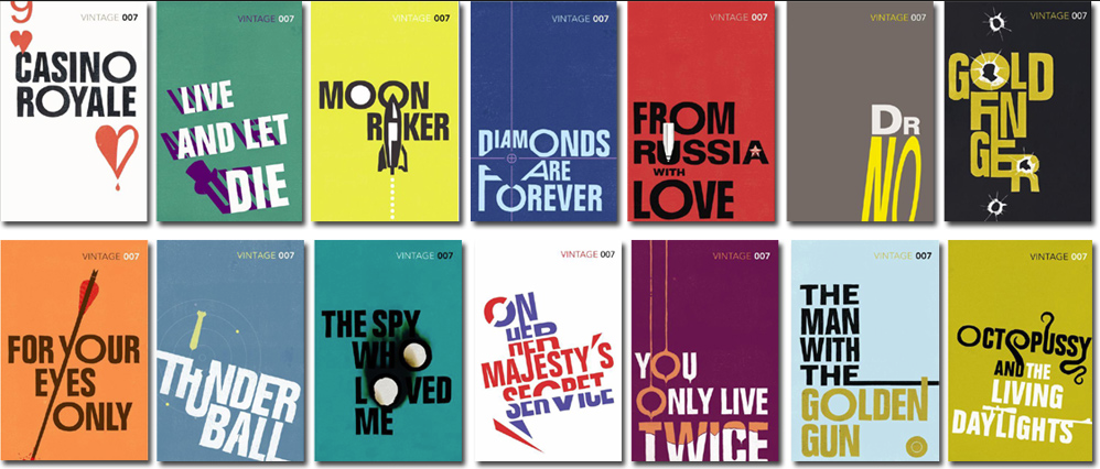
Our deadline was tight, and me and my team of 5 designers had to come up with a new classic look for the Fleming backlist. We needed to do something that hadn’t been done on these titles before. The brief I gave all the designers was to be inspired by Saul Bass, a graphic designer and filmmaker, perhaps best known for his design of film posters and motion-picture title sequences, including Psycho, The Man with the Golden Arm, and North by Northwest. Bass once described his main goal for his title sequences as being to ‘try to reach for a simple, visual phrase that tells you what the picture is all about and evokes the essence of the story’.
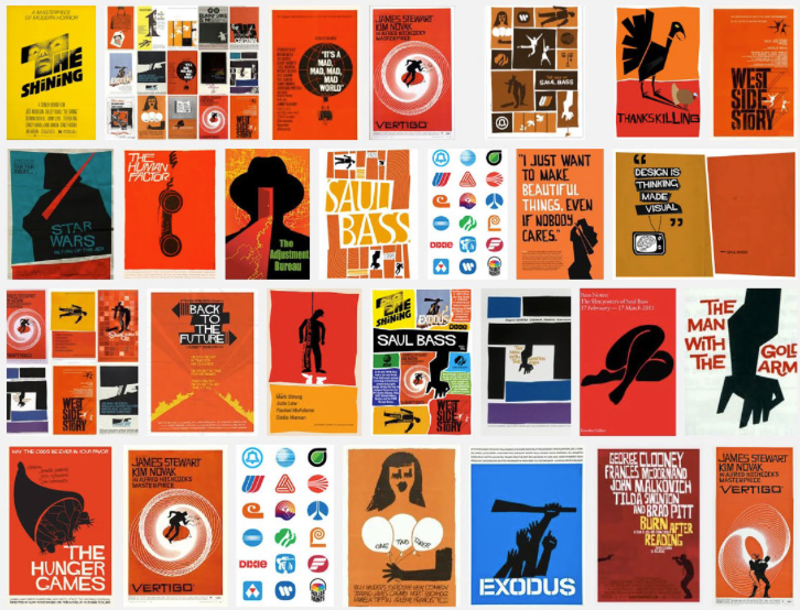
With six designers working over fourteen titles it was important for the visuals to cohere. Our colour palette was referenced from Bass’s posters, and we introduced an authentic retro feel by cutting out our designs. We all used the same font too. Folio was one of the first popular sans-serif fonts and was used in a lot of newspaper and display graphics of the period. As we were keen to reference the period and content when the books were written, rather than the movies of the sixties and seventies, the font was perfect for the graphic film posters of the fifties and sixties.
2. Are there other Ian Fleming re-issues in the works?
No…sadly
3. How were the famous authors chosen to contribute the wonderful introductions to each book?
This is down to editorial. They think about which author is most suitable and approach them
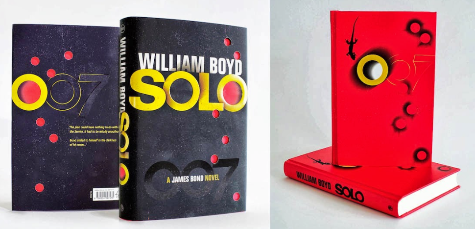
4. What was your inspiration for the Solo book jacket artwork?
I worked on the hardback edition of Solo. It was set in 1969, so like the classics, I wanted to achieve a period feel while ensuring the book still felt fresh and contemporary. This is a difficult balance. There is no doubt looking back on the designs of both the classics and Solo that I was also influenced by Saul Bass. I didn’t want just to depict a cinematic image, but rather to try and reflect the essence of Ian Fleming’s original novels as well William Boyd’s own take on James Bond. I always wanted to link the two O’s in Solo with 007. That was my starting point. I had been very keen on the title when it was first mentioned. I needed to appeal to literary and commercial audiences, both fans of the original 14 Fleming books and film fans. I needed to reflect both the content of the novel and capture the reader’s imagination.
5. How much of an impact did Richard Chopping have on book jacket design and how important do you think it is in today’s market?
I love these iconic Bond covers – some more than others – they are unique to their time. When I set about thinking of a new classics direction and brief, I wasn’t influenced by them. I was looking for something that would reflect the period and would feel fresh and contemporary. I felt Saul Bass’s work was a closer match.
Incidental Intelligence
 Suzanne Dean started designing for Penguin almost 20 years ago, then moved from there to Picador and Random House, and now oversees all of Cornerstone and Vintage publishing; she is also the only designer included in The Bookseller’s list of “100 most influential people in the book trade”.
Over the years, she has come up with a vast number of diverse and memorable covers: the silver first edition of Donna Tartt’s The Secret History, the hardback of Don DeLillo’s Underworld, Ian McEwan’s Atonement and Mark Haddon’s The Curious Incident of the Dog in the Night-Time, yet she has only started to put her name on them in the last four years or so.
She also recently designed the cover for the Man Booker prize winner ‘The Sense of an Ending’ by Julian Barnes.


Pingback: Suzanne Dean – Between The Sheafs
Pingback: Research Point: Publisher House Style – Jessica's Creative Arts Learning Blog
Pingback: 英語で読む村上春樹、初心者にもおすすめの短編絵本【レビュー】 – HALENG(ハレング)
Pingback: Exercise 2.3: Book designers